

Exhibition stand design: how to attract the right kind of attention.
- Thom Hayes

- Apr 24
- 5 min read
Updated: Apr 30

When every stand is competing for attention, getting noticed is only part of the job.
The real challenge is creating the kind of attention that helps people understand the brand, the offer, and what makes it worth remembering.
Exhibition spaces are noisy by nature. Everywhere you look, something is trying to pull focus. Big graphics. Bright colours. Screens. Clever lines. Giveaways. Movement. Noise for the sake of noise.
That is exactly why simply standing out is not enough.
A stand can catch the eye and still say very little.
Stands can create activity without creating interest. They can pull people in without giving them anything useful to connect with once they arrive. I see this a lot when businesses decide that sugary giveaways are their main way of attracting visitors, for example.
This is where the better question comes in: Not just how do I get noticed, but how do I attract the right kind of attention?
Strong copy should do more than decorate the stand
Clever words work best when they reveal something real.
This is where copy becomes more than a layer added on top.
A strong line on a stand can create a pause. It can catch someone slightly off guard, make them smile, or make them look twice. But the best exhibition copy does more than just sound clever. It hints at something underneath.
That is the difference between copy that is merely witty and copy that is useful. The useful version creates curiosity while also carrying part of the message.
It is not just playful for the sake of it. It has confidence. It creates curiosity. It invites a second look. But it also says something about tone, personality, and the sort of interaction the stand is trying to create.
Clever copy works best when it reveals something real, not when it is just trying to be clever.
A good exhibition line should not feel bolted on. It should feel like a doorway into the idea.
That matters even more in exhibition spaces, where people are making quick decisions about where to look, where to stop, and what feels worth their time.
Interaction should support the message, not distract from it
Not all engagement is meaningful.
A lot of stands try to create interaction because interaction sounds good on paper.
That can lead to games, distractions or set pieces that pull people in for a moment, but never really connect to the brand or the offer. The result is activity without much value.
That is not the same as meaningful engagement.
If the interaction could belong to any brand, it is probably not doing enough.
If the interaction is doing its job properly, it should help people understand something.
It should reinforce the message. It should reveal the brand personality. It should make the proposition easier to remember, not blurrier.
That is what makes this kind of design more interesting. The aim is not just to get people to touch, click or respond. It is to make sure that interaction is part of the idea itself.
A stand becomes much stronger when the design, the copy and the interaction are all pulling in the same direction.
The right kind of attention is often more valuable than more attention
A stand does not necessarily need to appeal to everyone in the room.
In many cases, the better result comes from attracting the people most likely to connect with the offer in the first place. That is where tone matters.
Confident, slightly disruptive copy can be useful because it acts as a filter as well as a magnet.
It catches the attention of the right people and starts the right kind of conversation.
That sort of confidence can make a stand feel alive. Not louder, just sharper.
And that is often the real difference between a concept that simply gets noticed and one that genuinely sticks.
What this looked like in one exhibition stand concept
This project became more interesting once the copy, visuals and interaction were all supporting the same idea.
This is where the concept moved beyond “make it eye-catching” and became more joined up.
The line 'Timewasters welcome' was not just there because it sounded cheeky on an exhibition stand. It worked because it tied directly to the brand message underneath: that without Guestline's product, hoteliers are wasting precious time.
That gave the copy more weight than a simple witty line would have had. It created the pause, but it also carried the proposition.
This is how the concept came together:

The aim was not just to make the stand look striking in isolation. It was to create a concept where the visuals and the words felt like parts of the same idea.
The game element gave that curiosity somewhere useful to go.
The interactive part of the concept mattered too. It was not there just to add movement or create a crowd. It was there to support the message. That is the difference between engagement and gimmick.
The game element gave people something to do with the curiosity the copy had created. It made the stand feel more alive, but it also helped reinforce the proposition rather than dragging attention away from it.
Seen that way, the interaction was not separate from the concept. It was part of how the concept worked.
This is how it went:



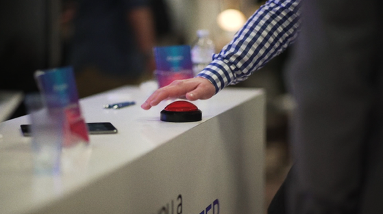


Taken together, the copy, visuals and interaction feel less like separate attention-grabbers and more like parts of one coherent system.
If you want to see the project itself in full, you can view it here: Exhibition stand concept and campaign design.
Design still has to do the heavy lifting
Copy may create the pause, but visual hierarchy still carries the message.
Even the strongest line in the world will not save a stand if the design around it is doing a poor job.
Exhibition design still has to work at a distance. It still has to guide the eye. It still has to tell people quickly what matters most and what deserves a closer look.
That means hierarchy matters.
People need to understand what they are looking at almost immediately.
They need a clear entry point, a reason to engage, and enough structure for the rest of the message to unfold without becoming cluttered.
That is why this is never just about writing one clever phrase and hoping for the best. The copy has to sit inside a design system that knows exactly how to support it.
The whole thing has to work together.
The best exhibition stands feel joined up, not bolted together
Good exhibition design does not treat copy, layout and interaction as separate things.
This is often the difference between a stand that looks polished and one that actually works.
If the copy feels like an afterthought, the interaction feels generic, or the visuals are doing all the heavy lifting alone, the concept starts to feel fragmented. Each part may be individually decent, but the overall experience feels less convincing.
A stand should not just attract attention. It should give people something to connect with.
The stronger approach is a joined-up one.
That means the copy creates the pause. The visual hierarchy supports the message. The interaction gives people a way to engage with the idea rather than just stand in front of it.
That is where a concept starts to feel complete.
Need exhibition design that does more than just fill space?
If you want exhibition design that combines strong visuals with sharper messaging, I can help with that too.
Whether it is a stand concept, campaign design, or graphic work that needs to do more than just look polished, the best results usually come from ideas that have something real to say.
If you would like to see more of that side of my work: